Cisco Design System 0 to 1
RESEARCH / DESIGN SYSTEM
Built a design system for Cisco CX Cloud from scratch.
VIEW PROJECT PDF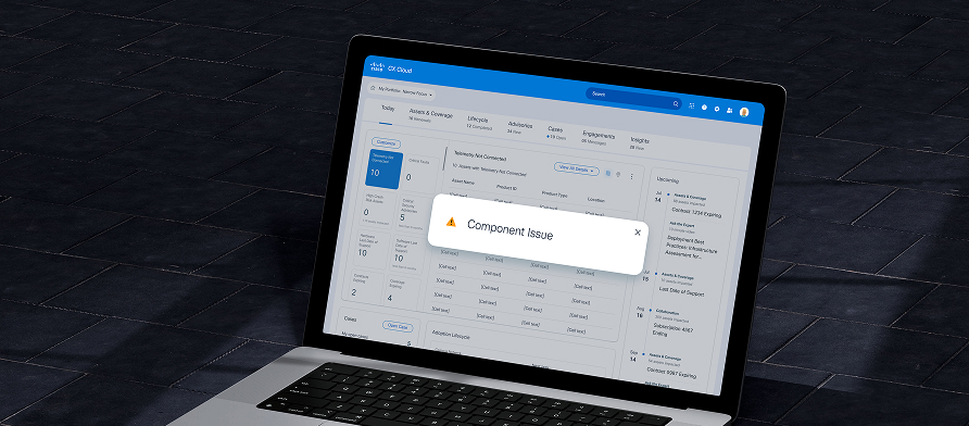
Introduction
Cisco CX Cloud is a platform that provides comprehensive visibility into customers' assets.
This project involved addressing component issues that arose during the transition to the new version of CX Cloud's layout and UI components and integrating these solutions into the design system.
The goal was to standardize the design process and deliver a consistent user experience.
Problem Statement
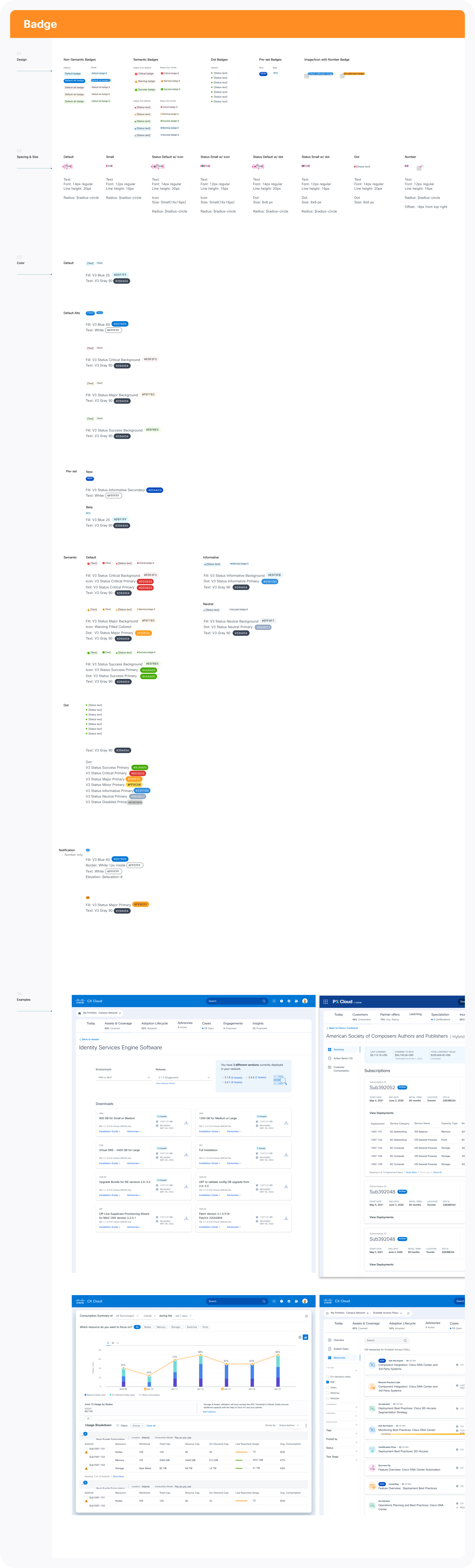
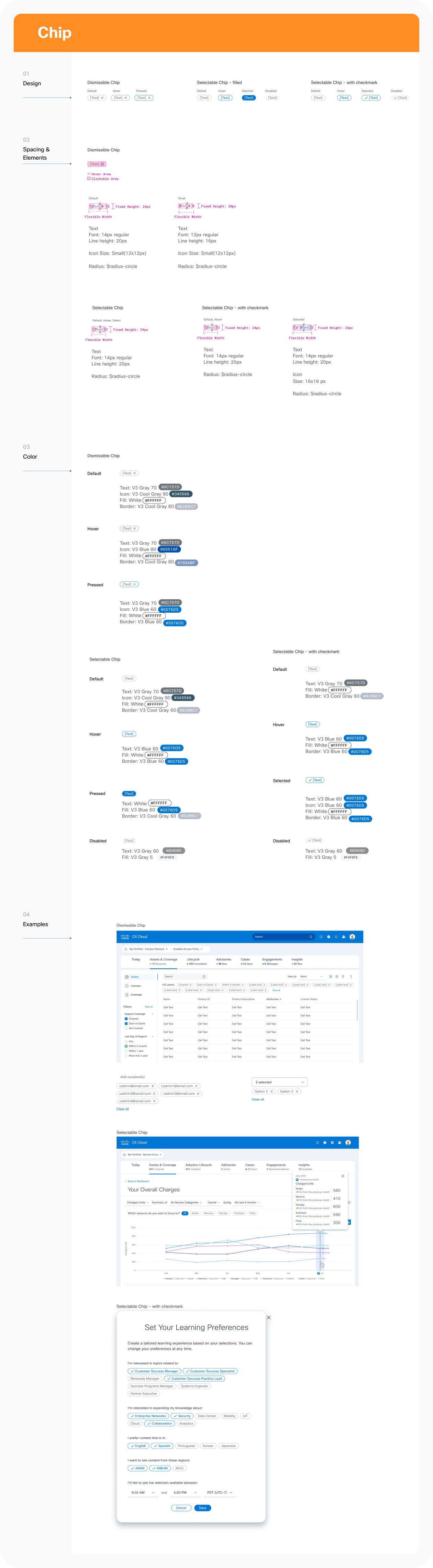
Chip? Badge? or Tag?
The CX Cloud design system was developed to reduce designers' working hours and improve efficiency during the HF design process.
However, during the process, we discovered a problem: components with different functionalities but similar styles were mixed together. This issue arose because many components were used without clear usage guidelines in the previous version of the product.
Designers often reused components from different screens, which led to additional work time and a mix of various component styles. This could cause confusion for users.
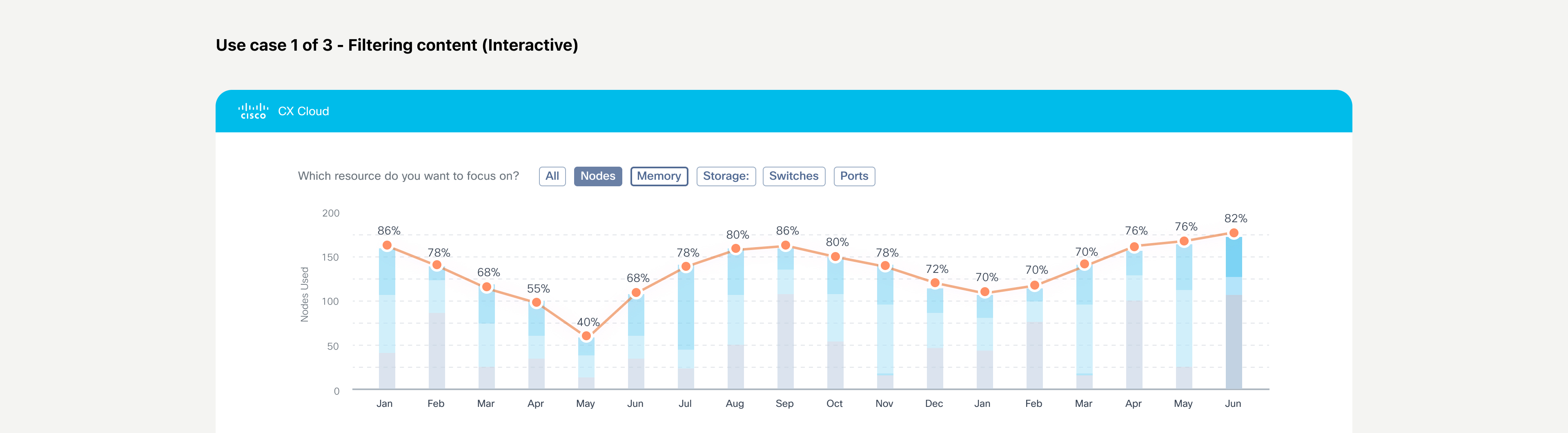
Use case 1 of 3 - Filtering content (Interactive)
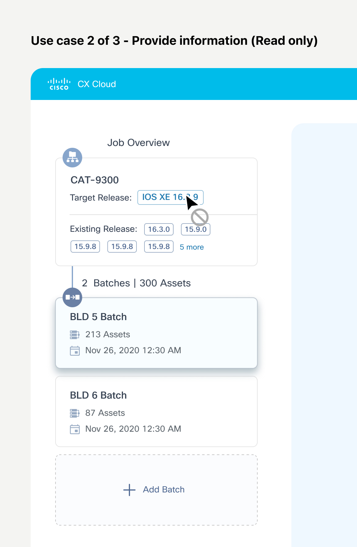
Use case 2 of 3 - Provide information (Read only)
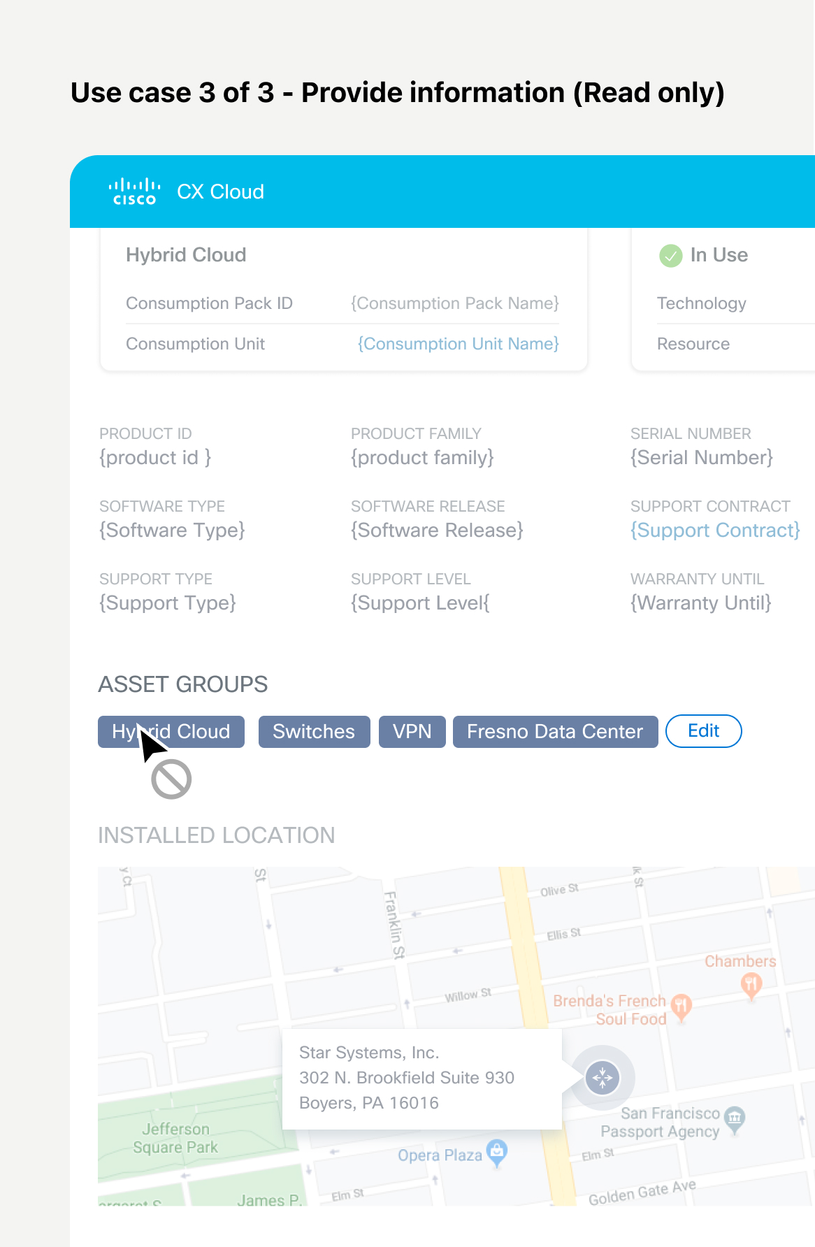
Use case 3 of 3 - Provide information (Read only)
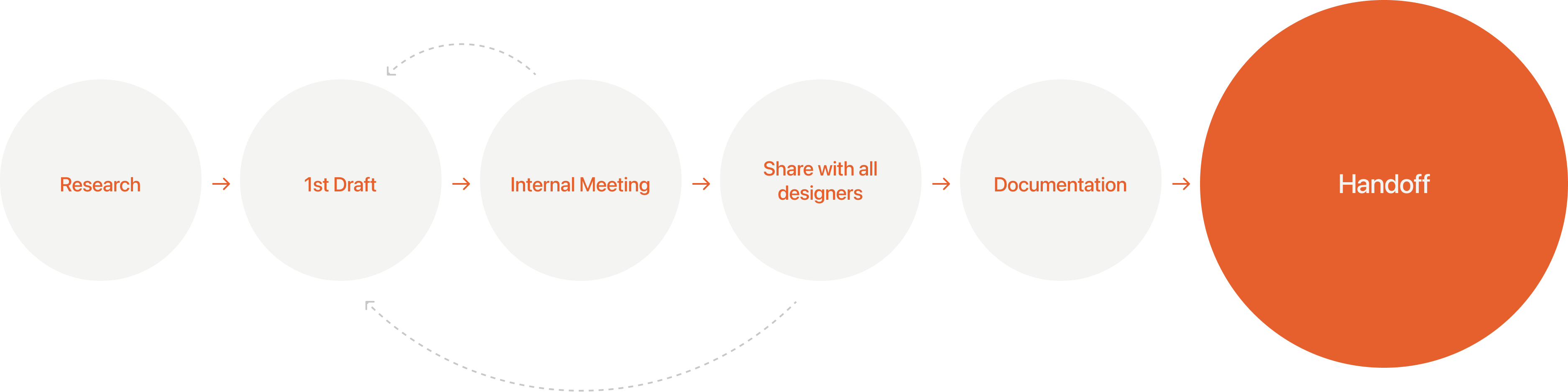
Project Process
Each component also went through a similar process to complete the design system.:
Research - Internal meetings - Sharing with the entire design team - Collecting feedback - Documentation
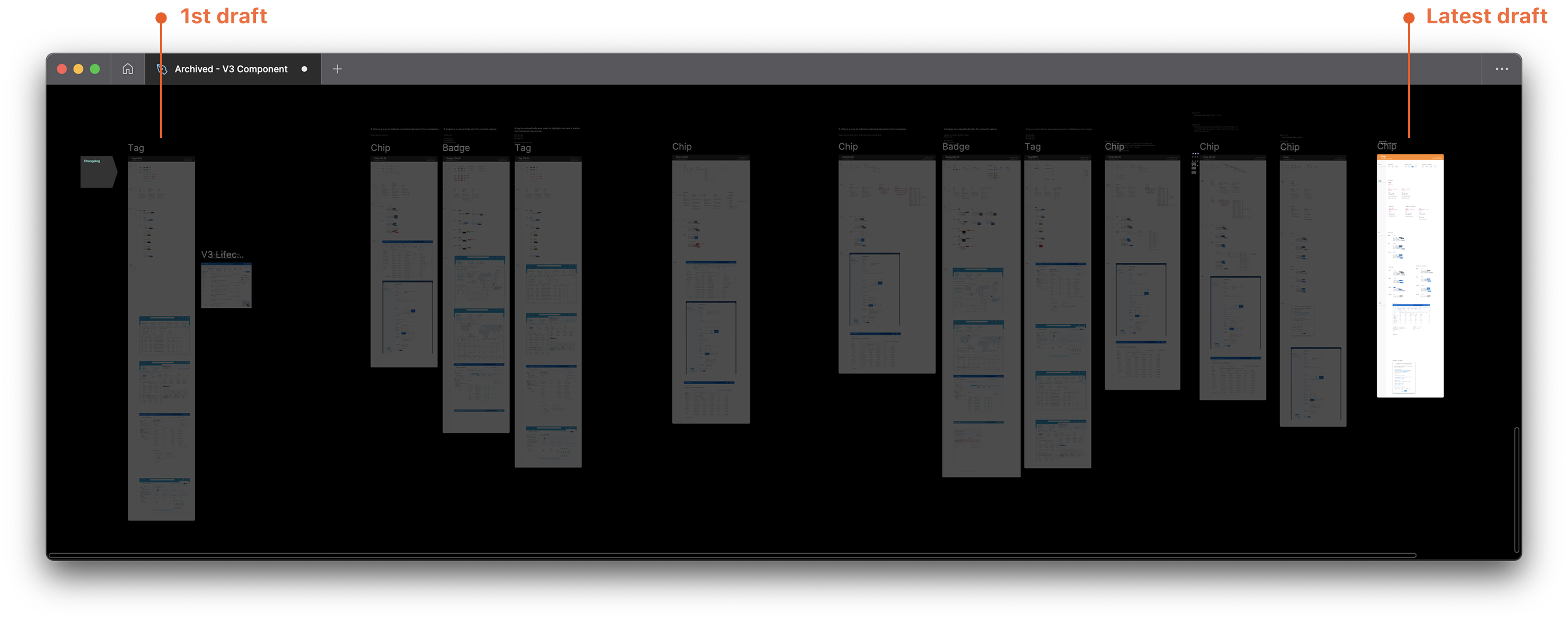
Actual Figma file I've worked on.
Industry research
Conducted research to get to know how others use the components.| Material | Atlassian | Carbon | Fluent | Spectrum | |
|---|---|---|---|---|---|
| Badge | Badges show notifications, counts, or status information on navigation items and icons. | A badge is a visual indicator for numeric values such as tallies and scores. | - | A badge is a visual indicator that communicates a status or description of an associated component. | Badges are for showing a small amount of color-categorized metadata. They're ideal for getting a user's attention. |
| Chip | Chips help people enter information, make selections, filter content, or trigger actions | - | - | - | - |
| Tag | - | A tag labels UI objects for quick recognition and navigation. | Use tags to label, categorize, or organize items using keywords that describe them. | A tag is a representation of a value that someone has picked, like recipients for an email or categories on a planner task. | Tags allow users to categorize content. They can represent keywords or people, and are grouped to describe an item or a search request. |
| Lozenge | - | A lozenge is a visual indicator used to highlight an item's status for quick recognition. | - | - | - |
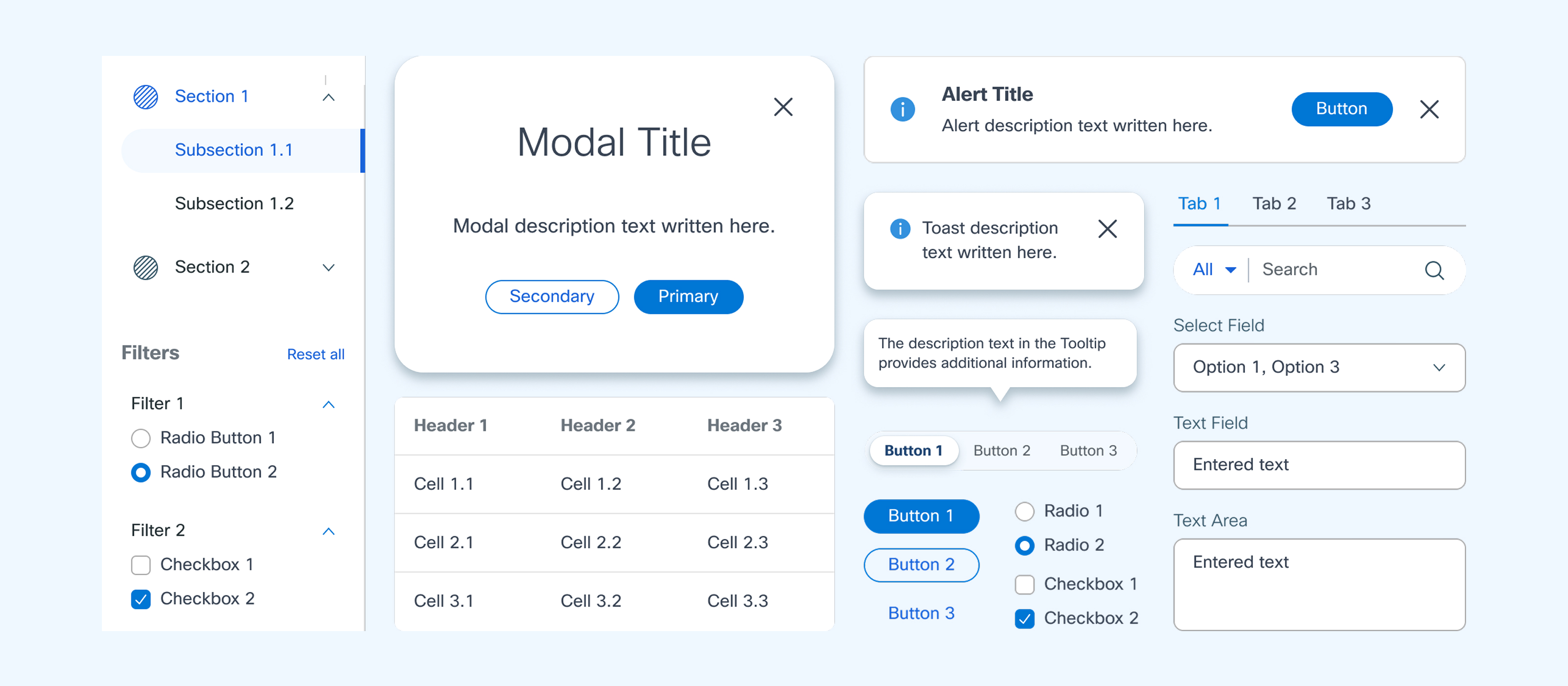
Final Style Guideline
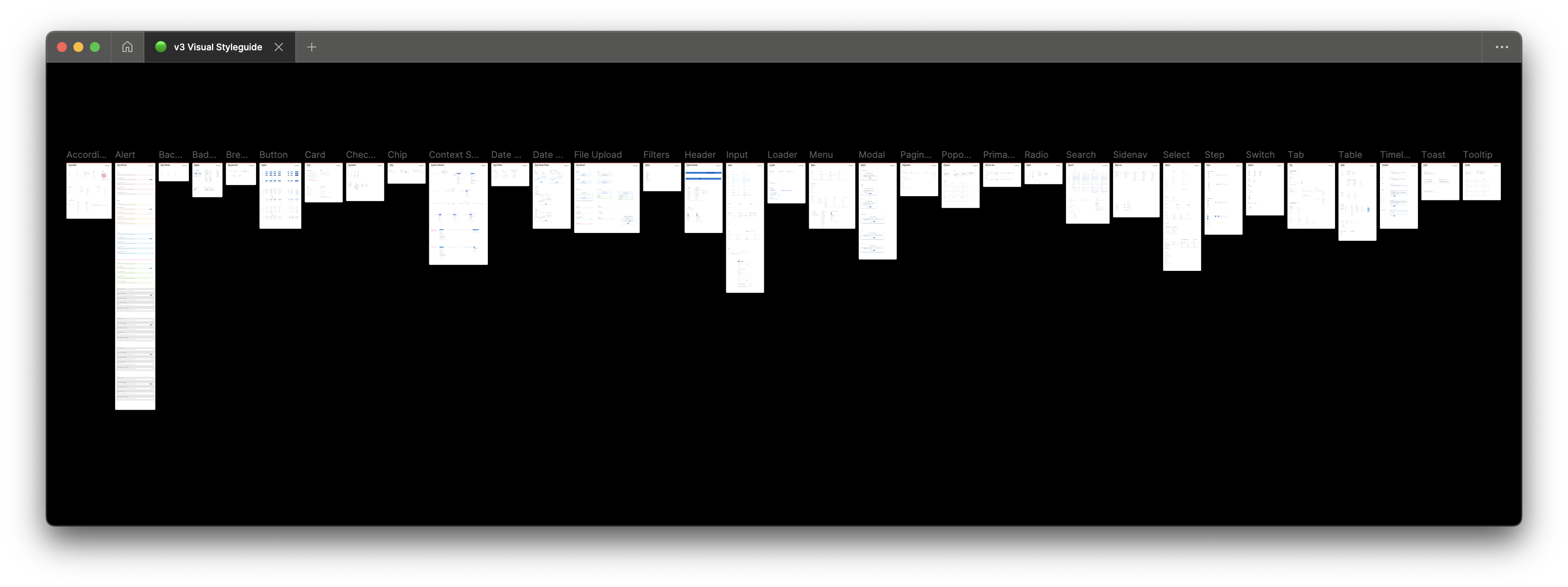
Components Sticker Sheet in Figma
Impact
The design system resolved thess issues:
1. Designers now have a clear and accessible place to find the components they need.
2. Guidelines were established to inform them when and how to use the components, preventing confusion.
3. Ultimately, it delivers a consistent user experience.